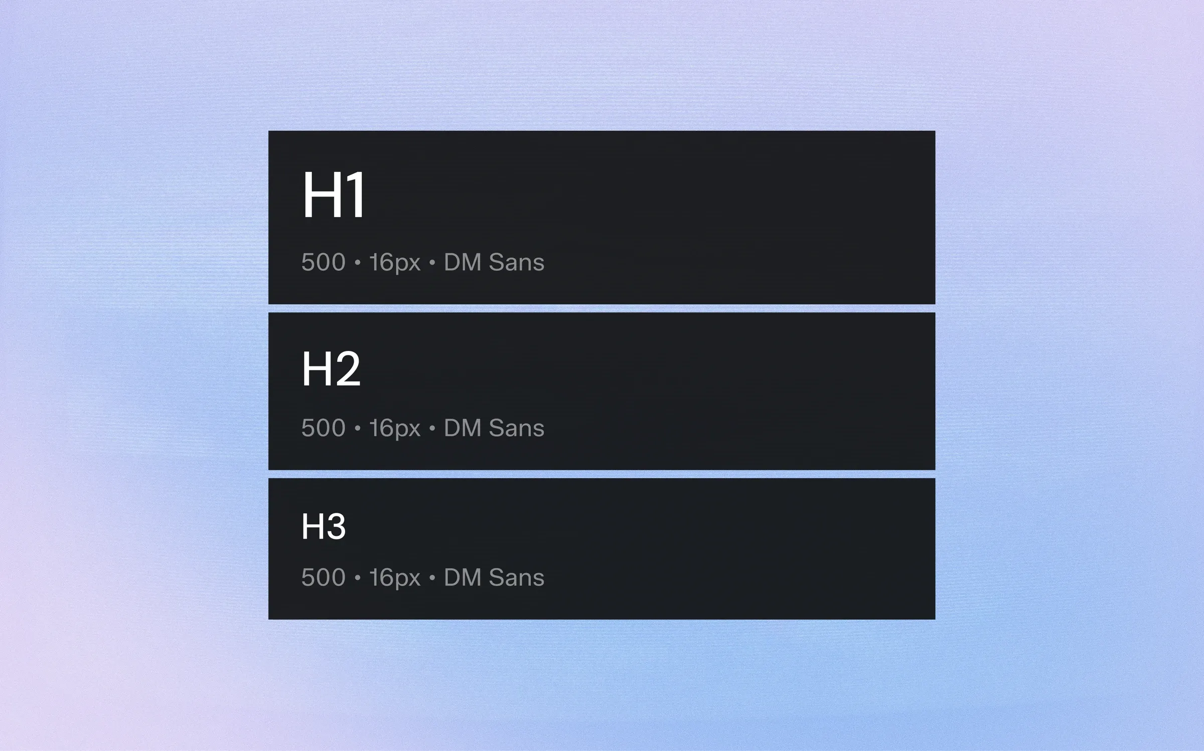
Typography carries most of the information on any screen. A consistent type system is the quickest way to make several products feel like one family.
1. Choose a Scale, Not Sizes
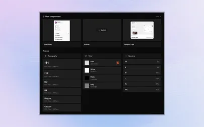
Pick a small set of sizes with clear roles — display, H1 to H3, body sizes and captions — instead of choosing sizes screen by screen.
2. Pair Size with Line Height
Every size needs its own line height.
Store them together as one token so nobody ever pairs 28px text with a 16px line height again.
3. Name by Role
"titles-h2" or "body-l" survive redesigns better than "28-semibold".
Role names also make it obvious which style to use in a new component.
4. Adapt for Mobile
Headings that work at 1920px feel oversized on a phone.
Give each role a mobile value and let the scale switch at breakpoints, so components never need their own overrides.
5. Limit Weights
Two or three weights are enough for strong hierarchy. Every extra weight is another decision and another file to load.
Typography carries most of the information on any screen. A consistent type system is the quickest way to make several products feel like one family.
1. Choose a Scale, Not Sizes
Pick a small set of sizes with clear roles — display, H1 to H3, body sizes and captions — instead of choosing sizes screen by screen.
2. Pair Size with Line Height
Every size needs its own line height.
Store them together as one token so nobody ever pairs 28px text with a 16px line height again.
3. Name by Role
"titles-h2" or "body-l" survive redesigns better than "28-semibold".
Role names also make it obvious which style to use in a new component.
4. Adapt for Mobile
Headings that work at 1920px feel oversized on a phone.
Give each role a mobile value and let the scale switch at breakpoints, so components never need their own overrides.
5. Limit Weights
Two or three weights are enough for strong hierarchy. Every extra weight is another decision and another file to load.