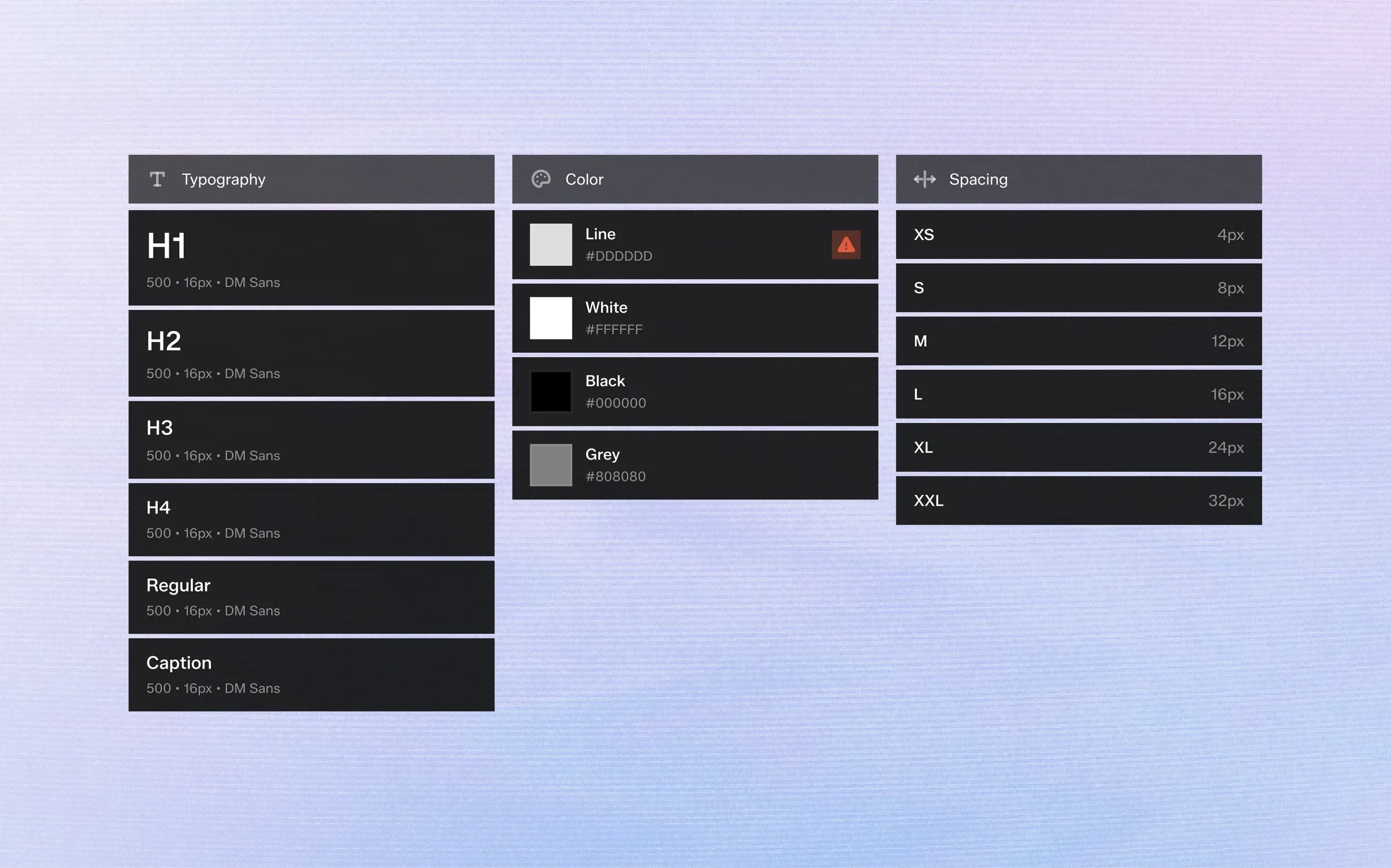
Design tokens are the smallest decisions in a design system: a color, a font size, a spacing step. Named and shared, they become the vocabulary designers and developers use to describe every interface.
1. What a Token Is
A token is a name paired with a value.
--bg-accent might resolve to a soft lilac today and to a new brand color next year. Components refer to the name, never the value.
That single layer of indirection is what makes a system easy to change.
2. Primitives and Semantic Tokens
Most mature systems use two tiers.
Primitives describe the raw palette and scale: every grey, every accent, every spacing step.
Semantic tokens describe intent: main background, secondary text, error line. Components only ever use semantic tokens, so a theme change means remapping one tier instead of repainting every screen.
3. Naming That Survives Growth
Name tokens by role, not by appearance.
"text-secondary" still makes sense when the value changes from grey to blue. "grey-text" doesn't.
Keep states in the name as suffixes — hover, pressed, disabled — so every interactive element can find its variants without guesswork.
4. Responsive Tokens
Spacing and typography rarely stay the same across screen sizes.
Instead of separate mobile and desktop components, define one token with a value per breakpoint. The component stays the same; only the scale changes.
5. Tokens Beyond the Design File
Tokens are only valuable if they reach production.
Export them as CSS custom properties, platform variables or JSON so developers consume exactly the values designers chose — and regenerate them whenever the design changes.
Design tokens are the smallest decisions in a design system: a color, a font size, a spacing step. Named and shared, they become the vocabulary designers and developers use to describe every interface.
1. What a Token Is
A token is a name paired with a value.
--bg-accent might resolve to a soft lilac today and to a new brand color next year. Components refer to the name, never the value.
That single layer of indirection is what makes a system easy to change.
2. Primitives and Semantic Tokens
Most mature systems use two tiers.
Primitives describe the raw palette and scale: every grey, every accent, every spacing step.
Semantic tokens describe intent: main background, secondary text, error line. Components only ever use semantic tokens, so a theme change means remapping one tier instead of repainting every screen.
3. Naming That Survives Growth
Name tokens by role, not by appearance.
"text-secondary" still makes sense when the value changes from grey to blue. "grey-text" doesn't.
Keep states in the name as suffixes — hover, pressed, disabled — so every interactive element can find its variants without guesswork.
4. Responsive Tokens
Spacing and typography rarely stay the same across screen sizes.
Instead of separate mobile and desktop components, define one token with a value per breakpoint. The component stays the same; only the scale changes.
5. Tokens Beyond the Design File
Tokens are only valuable if they reach production.
Export them as CSS custom properties, platform variables or JSON so developers consume exactly the values designers chose — and regenerate them whenever the design changes.